
【动画消消乐】HTML+CSS 自定义加载动画 059
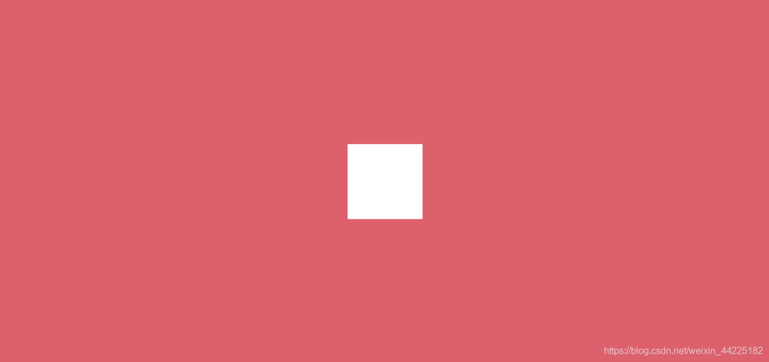
效果展示

Demo代码
HTML
<!DOCTYPE html>
<html lang="en">
<head>
    <meta charset="UTF-8">
    <meta http-equiv="X-UA-Compatible" content="IE=edge">
    <meta name="viewport" content="width=device-width, initial-scale=1.0">
    <link rel="stylesheet" href="style.css">
    <title>Document</title>
</head>
<body>
    <section><span></span></section>
</body>
</html>
CSS
html, body {
  margin: 0;
  height: 100%;
}

body {
  display: flex;
  justify-content: center;
  align-items: center;
  background: #ed556a;
}

section {
  width: 650px;
  height: 300px;
  padding: 10px;
  position: relative;
  display: flex;
  align-items: center;
  justify-content: center;
  border: 2px solid white;
}

span {
  width: 64px;
  height: 64px;
  display: inline-block;
  position: relative;
  background: white;
  animation: loading 2s ease infinite alternate-reverse;
}

@keyframes loading {
  0% {
    transform: scale(1) rotate(0deg)
  }
  100% {
    transform: scale(.1) rotate(360deg)
  }
}
原理详解
步骤1
使用span标签,设置为
宽度、高度均为64px 相对定位 背景色:白色
span {
  width: 64px;
  height: 64px;
  position: relative;
  background: white;
}
效果图如下
步骤2
为span添加动画
初始(0%):大小为1(相对原图像)旋转0度 末尾(10%):大小为.1(相对原图像) 旋转360度
动画本质上是两个变化的叠加
大小从1变为.1(相对于原大小) 旋转角度从0到360度
animation: loading 2s ease infinite ;
@keyframes loading {
  0% {
    transform: scale(1) rotate(0deg)
  }
  100% {
    transform: scale(.1) rotate(360deg)
  }
}
效果图如下

步骤3
动画设置为alternate-reverse
❝alternate-reverse :动画在奇数次(1、3、5...)反向播放,在偶数次(2、4、6...)正向播放。
animation: loading 2s ease infinite alternate-reverse;
效果图如下
结语
希望对您有所帮助
如有错误欢迎小伙伴指正~
我是 海轰ଘ(੭ˊᵕˋ)੭
如果您觉得写得可以的话
请点个赞吧
谢谢支持❤️
评论