
【开发小技巧】031—用CSS3如何实现钟摆动画的导航栏菜单效果

<link rel='stylesheet' href='https://cdnjs.cloudflare.com/ajax/libs/twitter-bootstrap/4.1.3/css/bootstrap.min.css'><link rel='stylesheet' href='https://cdnjs.cloudflare.com/ajax/libs/animate.css/3.7.2/animate.min.css'><link rel='stylesheet' href='https://cdnjs.cloudflare.com/ajax/libs/font-awesome/5.11.2/css/all.min.css'>
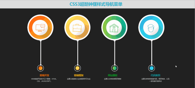
CSS3超酷钟摆样式导航菜单 CSS3超酷钟摆样式导航菜单
body, html { font-size: 100%; padding: 0; margin: 0;}*,*:after,*:before { -webkit-box-sizing: border-box;-moz-box-sizing: border-box;box-sizing: border-box;}.clearfix:before,.clearfix:after { content: " "; display: table;}.clearfix:after {clear: both;}body{background: #222;color: #D5D6E2;font-weight: 500;font-size: 1.05em;font-family: "Microsoft YaHei","Segoe UI", "Lucida Grande", Helvetica, Arial,sans-serif;}.webqdkf-links a{ color: rgba(255, 255, 255, 0.6);outline: none;text-decoration: none;-webkit-transition: 0.2s;transition: 0.2s;}.webqdkf-links a:hover,.webqdkf-links a:focus{color:#74777b;text-decoration: none;}.webqdkf-container{margin: 0 auto;}.bgcolor-1 { background: #f0efee; }.bgcolor-2 { background: #f9f9f9; }.bgcolor-3 { background: #e8e8e8; }.bgcolor-4 { background: #2f3238; color: #fff; }.bgcolor-5 { background: #df6659; color: #521e18; }.bgcolor-6 { background: #2fa8ec; }.bgcolor-7 { background: #d0d6d6; }.bgcolor-8 { background: #3d4444; color: #fff; }.bgcolor-9 { background: #ef3f52; color: #fff;}.bgcolor-10{ background: #64448f; color: #fff;}.bgcolor-11{ background: #3755ad; color: #fff;}.bgcolor-12{ background: #3498DB; color: #fff;}.bgcolor-20{ background: #494A5F;color: #D5D6E2;}.webqdkf-header{padding: 1em 190px 1em;letter-spacing: -1px;text-align: center;background: #dedede;}.webqdkf-header h1 {color: #1ab1cc;font-weight: 600;font-size: 2em;line-height: 1;margin-bottom: 0;}.webqdkf-header h1 span {display: block;font-size: 60%;font-weight: 400;padding: 0.8em 0 0.5em 0;color: #c3c8cd;}.webqdkf-demo a{color: #fff;text-decoration: none;}.webqdkf-demo{width: 100%;padding-bottom: 1.2em;}.webqdkf-demo a{display: inline-block;margin: 0.5em;padding: 0.6em 1em;border: 3px solid #fff;font-weight: 700;}.webqdkf-demo a:hover{opacity: 0.6;}.webqdkf-demo a.current{background:#1d7db1;color: #fff; }.webqdkf-links {position: relative;display: inline-block;white-space: nowrap;font-size: 1.5em;text-align: center;}.webqdkf-links::after {position: absolute;top: 0;left: 50%;margin-left: -1px;width: 2px;height: 100%;background: #dbdbdb;content: '';-webkit-transform: rotate3d(0,0,1,22.5deg);transform: rotate3d(0,0,1,22.5deg);}.webqdkf-icon {display: inline-block;margin: 0.5em;padding: 0em 0;width: 1.5em;text-decoration: none;}.webqdkf-icon span {display: none;}.webqdkf-icon:before {margin: 0 5px;text-transform: none;font-weight: normal;font-style: normal;font-variant: normal;font-family: 'icomoon';line-height: 1;speak: none;-webkit-font-smoothing: antialiased;}.related {color: #fff;background: #494A5F;text-align: center;font-size: 1.25em;padding: 0.5em 0;overflow: hidden;}.related > a {vertical-align: top;width: calc(100% - 20px);max-width: 340px;display: inline-block;text-align: center;margin: 20px 10px;padding: 25px;font-family: "Microsoft YaHei","宋体","Segoe UI", "Lucida Grande", Helvetica, Arial,sans-serif, FreeSans, Arimo;}.related a {display: inline-block;text-align: left;margin: 20px auto;padding: 10px 20px;opacity: 0.8;-webkit-transition: opacity 0.3s;transition: opacity 0.3s;-webkit-backface-visibility: hidden;text-decoration: none;}.related a:hover,.related a:active {opacity: 1;}.related a img {max-width: 100%;opacity: 0.8;border-radius: 4px;}.related a:hover img,.related a:active img {opacity: 1;}.related h3{font-family: "Microsoft YaHei", sans-serif;font-size: 1.2em}.related a h3 {font-size: 0.85em;font-weight: 300;margin-top: 0.15em;color: #fff;}.icon-webqdkf-home-outline:before {content: "\e5000";}.icon-webqdkf-arrow-forward-outline:before {content: "\e5001";}@media screen and (max-width: 1024px) {.webqdkf-header {padding: 2em 10% 2em;}.webqdkf-header h1 {font-size:1.4em;}.webqdkf-links{font-size: 1.4em}}@media screen and (max-width: 960px) {.webqdkf-header {padding: 2em 10% 2em;}.webqdkf-header h1 {font-size:1.2em;}.webqdkf-links{font-size: 1.2em}.related h3{font-size: 1em;}.related a h3 {font-size: 0.8em;}}@media screen and (max-width: 766px) {.webqdkf-header h1 {font-size:1.3em;}.webqdkf-links{font-size: 1.3em}}@media screen and (max-width: 640px) {.webqdkf-header {padding: 2em 10% 2em;}.webqdkf-header h1 {font-size:1em;}.webqdkf-links{font-size: 1em}.related h3{font-size: 0.8em;}.related a h3 {font-size: 0.6em;}}.box1{height: 200px;width: 200px;background-image: linear-gradient(to right bottom, #fd4617, #ff6d12, #ff8d19, #ffaa2c, #ffc445);border-radius: 50%;border: 10px solid white;overflow:hidden;margin:auto;box-shadow: 11px 11px 12px -9px rgba(27, 14, 0, 0.28);}.box2{height: 200px;width: 200px;background-image: linear-gradient(to right bottom, #fff05a, #ffde56, #ffcc55, #ffbb57, #ffaa5a);box-shadow: 11px 11px 12px -9px rgba(27, 14, 0, 0.28);border-radius: 50%;border: 10px solid white;overflow:hidden;margin:auto;}.box3{height: 200px;width: 200px;background: #00b09b;background: -webkit-linear-gradient(to right, #96c93d, #00b09b);background: linear-gradient(to right, #96c93d, #00b09b);box-shadow: 11px 11px 12px -9px rgba(27, 14, 0, 0.28);border-radius: 50%;border: 10px solid white;overflow:hidden;margin:auto;}.box4{height: 200px;width: 200px;background-image: linear-gradient(to right bottom, #3da5d9, #2eb9e4, #29ccec, #38dff1, #54f2f2);box-shadow: 11px 11px 12px -9px rgba(27, 14, 0, 0.28);border-radius: 50%;border: 10px solid white;overflow:hidden;margin:auto;}.box1-inner{background-color: #ffffff;height: 120px;width: 120px;border-radius: 50%;margin: 31px auto;background-image: linear-gradient(to right bottom, #ffffff, #fffefe, #fbfbfb, #f1ecec, #d2d2d2);box-shadow: 36px 27px 11px -5px rgba(27, 14, 0, 0.16);border: 1px solid #e6e5e4;transition:1s;cursor:pointer;animation: swing ease-in-out .3s infinite alternate;transform-origin: top;transform-box: fill-box;left: calc(42% - .0rem);}.box1-inner:hover{box-shadow: -25px 50px 11px -5px rgba(27, 14, 0, 0.16);transition:1s;}.icon-set{text-align: center;width: 100%;margin: auto;padding-top: 24px;float: left;}.text-heading{position: absolute;top: 230%;left: 22%;}.text-heading h3{text-transform: uppercase;text-align: center;font-size: 18px;}.text-heading p{text-transform: uppercase;text-align: center;font-size: 10px;}.color1 h3{color: #ff6a00;}.color2 h3{color: #ffbc00;}.color3 h3{color: #06af23;}.color4 h3{color: #06a7af;}p a{color:#b2b8b9;}p a:hover{color:#fff;}.box1:after,.box2:after,.box3:after,.box4:after{content: '';background-color: white;height: 200px;width: 5px;position: absolute;left: 50%;box-shadow: 1px 3px 6px 1px rgba(0, 0, 0, 0.05);z-index: -1;}.box1:before,.box2:before,.box3:before,.box4:before{content: '';height: 15px;width: 15px;background-color: white;position: absolute;border-radius: 50%;bottom: -8px;left: 48.1%;}.small-box1{height: 50px;width: 50px;border-radius: 50%;border: 2px solid white;position: absolute;bottom: -120%;left: 41.7%;box-shadow: 1px 3px 3px rgba(0, 0, 0, 0.21);animation: swing ease-in-out .3s infinite alternate;transform-origin: top;transform-box: fill-box;left: calc(42% - .0rem);}.small-box1:after{content: '';height: 10px;width: 10px;background-color: white;border-radius: 50%;position: absolute;top: -7px;left: 41.5%;}.small-box1 div{height: 30px;width: 30px;border-radius: 50%;margin: auto;margin-top: 8px;box-shadow: 1px 3px 3px rgba(0, 0, 0, 0.21);}.color1 div{background-image: linear-gradient(to right bottom, #fd4617, #ff6d12, #ff8d19, #ffaa2c, #ffc445);}.color2 div{background-image: linear-gradient(to right bottom, #fff05a, #ffde56, #ffcc55, #ffbb57, #ffaa5a);}.color3 div{background: #00b09b;background: -webkit-linear-gradient(to right, #96c93d, #00b09b);background: linear-gradient(to right, #96c93d, #00b09b);}.color4 div{background-image: linear-gradient(to right bottom, #3da5d9, #2eb9e4, #29ccec, #38dff1, #54f2f2);}@keyframes swing {0% { transform: rotate(8deg); }100% { transform: rotate(-8deg); }}@media only screen and (max-width: 1024px){.box1:after, .box2:after, .box3:after, .box4:after{height: 172px;}.small-box1:after{left: 29.5%;}.small-box1{left: calc(40% - .0rem);}.box1 {height: 150px;width: 150px;}.box2 {height: 150px;width: 150px;}.box3 {height: 150px;width: 150px;}.box4 {height: 150px;width: 150px;}.box1-inner{height: 100px;width: 100px;margin: 14px auto;}svg{width:60%;}.icon-set{padding-top: 10px;}.small-box1{bottom: -142%;}.text-heading{top: 251%;}}@media only screen and (max-width: 768px){.small-box1{left: calc(37% - .0rem);bottom: -144%;}.box1 {height: 120px;width: 120px;}.box2 {height: 120px;width: 120px;}.box3 {height: 120px;width: 120px;}.box4 {height: 120px;width: 120px;}.box1-inner{height: 70px;width: 70px;margin: 14px auto;}svg{width:50%;}.icon-set{padding-top: 0px;}.text-heading h3{font-size: 14px;}.box1:after, .box2:after, .box3:after, .box4:after{height: 140px;}.text-heading p{font-size: 8px;}.text-heading{top: 251%;}}@media only screen and (max-width: 425px){.box{height: 300px;margin-bottom: 30px;}.small-box1{left: calc(44% - .0rem);bottom: 15%;}.box1:before, .box2:before, .box3:before, .box4:before{bottom: 145px;left: 48.8%;}.box1 {height: 150px;width: 150px;}.box2 {height: 150px;width: 150px;}.box3 {height: 150px;width: 150px;}.box4 {height: 150px;width: 150px;}.box1-inner{height: 80px;width: 80px;margin: 26px auto;}svg{width:60%;}.icon-set{padding-top: 0px;}.text-heading h3{font-size: 14px;}.box1:after, .box2:after, .box3:after, .box4:after{height: 60px;}.text-heading p{font-size: 8px;}.text-heading {top: 88%;left: 35%;}.circle1{right: 25%;}.circle2{right: 16%;}.circle3{right: 9%;}}@media only screen and (max-width: 425px){.box1:before, .box2:before, .box3:before, .box4:before{left: 48.7%;}.small-box1:after{left: 37%;}}@media only screen and (max-width: 425px){@media only screen and (max-width: 425px){body{height: 903vh;}.text-heading {left: 30%;}.small-box1 {left: calc(43.8% - .0rem);}}

评论